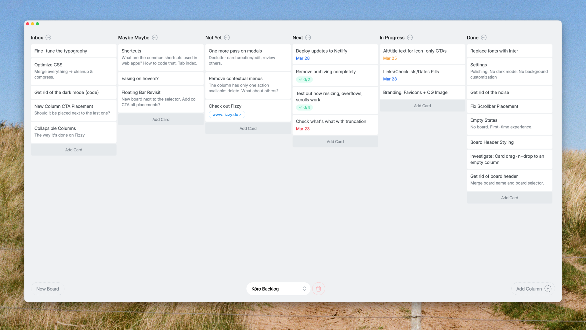
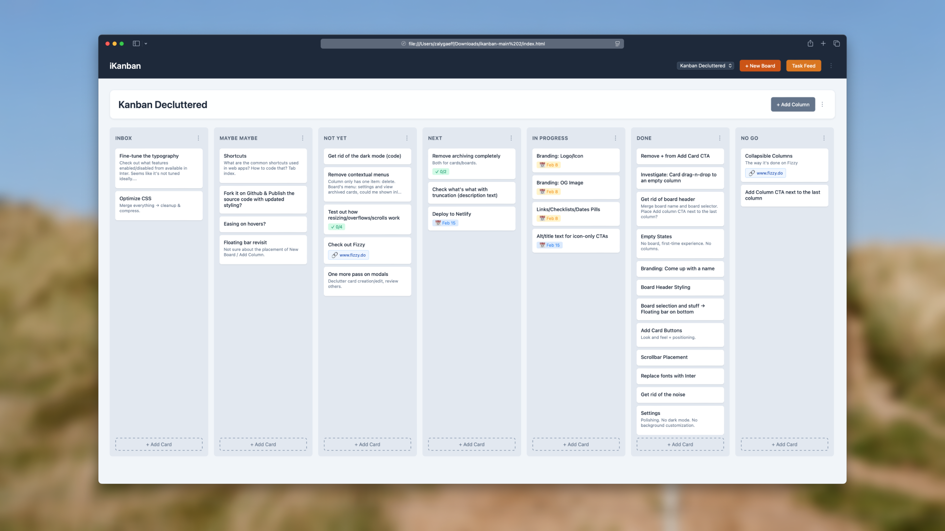
For a long time, I had been searching for a kanban tool that felt lightweight and uncluttered. Something like Trello when it first launched, before it became what Atlassian turned it into. Then I stumbled upon iKanban: lightweight, local-first, open-source, and backend-free. It was a PWA, which meant no server setup, no deployment headaches. The problem was strictly visual. The interface was hard to read, visually unappealing, and failed to convey focus. It did not provide the clarity I was looking for.
I decided to take iKanban as a starting point and redesign it completely. The goal was not to create a flashy product, but to make something I could use daily without frustration, where content takes center stage and the interface fades into the background.
The main problem was this: the kanban itself was being held hostage by the interface. Cards were small, hard to read, and lost among borders, rectangles, and visual clutter. The content was treated as secondary, which is the reverse of what a tool like this should do.
The solution was simple to define. Cards, or the content they contain, must become the central element. Everything else must recede into the background. Noise is reduced, and signal becomes the focus. Legibility is the foundation. Elements that do not directly contribute to understanding or action should be ambient and muted.
Once the problem was framed, I approached the redesign in a top-down way. First, the board itself. Then the surrounding chrome (header, board selection, CTAs, etc.). Finally, optional elements such as empty states, modals, and other minor features. To keep the design grounded in reality, I created tasks for every component as I was working on it, directly in the app. This allowed me to test the tool while building it, mirroring the philosophy reportedly used when Keynote was designed in Keynote.
Subtraction was as important as addition. Some features simply had to go. The task feed, which collects all to-dos across cards into a single view, was clever but ultimately unnecessary. Dark mode was removed. I avoid it unless it is absolutely necessary, and in this context, it was not. Custom backgrounds were eliminated. A productivity tool should be neutral, almost invisible, and focused on content rather than aesthetics.
Before and after: decorations reduced to a functional minimum, legibility dramatically improved, noise reduced. Content becomes central.
Development was practical and pragmatic. The goal was personal use, so the approach could be rough around the edges. Overrides were sometimes messy, but the tool worked. Diving into 1500 lines of code was daunting; hiding a single element could break the app entirely, but the end result was functional.
ChatGPT was used occasionally for consultation, such as replacing a browser-native select element, but most of the work relied on my existing knowledge and hands-on problem solving. This was not about vibe coding. It was about achieving a usable tool quickly, with an emphasis on clarity and simplicity over perfection of the codebase. Working in the tool as I built it was invaluable. I could immediately see the impact of every change, and the iterative feedback loop was direct and uncompromising.
Debugging the drag-and-drop turned out to be trickier than expected — it broke more than once along the way.
The original “i” prefix felt outdated and irrelevant. Generic options like knbn or Taskboard were sterile and lacked meaning. I wanted something more meaningful and minimal. I leaned toward abstract, Japanese-inspired names that paid subtle tribute to the origin. After a few sessions with a machine-copywriter, I shortlisted Ma, Nagare, and Kōro.
Ma conveys the idea of space or interval, Nagare conveys flow, and Kōro literally means route or course, typically in the context of navigation. Kōro was chosen. It is short, minimal, meaningful, and pleasant to say.
The visual identity mirrors the tool itself: neutral, almost invisible, yet recognizable. Since the only touchpoint is the icon in the dock, its mission was simple: to stand out among other icons. Therefore, a white background and a simple arrow were chosen, with the arrow representing a course in the navigation sense.
This project was rewarding. A useful tool appeared at the right time, and redesigning it was clear and deliberate. Iterating as it was built added practical insight. Subtracting features, simplifying interaction, and emphasizing the card created a kanban that works for daily use. Kōro revealed insights beyond theory: the calm interface keeps focus, cards are readable at a glance, and everything else recedes. Tasks can be moved, completed, or edited without distraction. The tool remains quietly in the corner of daily work, supportive but unobtrusive.
Future refinements are possible, including keyboard shortcuts, removing contextual menus, and subtle interaction improvements. For now, observation is key. Let the current version settle, watch how it’s used, and let real needs guide any changes.
The demo is fully functional, though some minor bugs may exist.
All data is stored locally in your browser, so keep that in mind if you clear your history.